Demo Videos Refresh
Art Direction | Storyboarding | Video & Motion Design
Project Overview
TikTok wanted to revamp the look of our new feature demo videos to reflect our new brand identity, better engage with our users, and overall increase brand awareness. The goal was to create easily digestible guides that encourage users and creators to use new features through short-form in-feed videos and one-pager pdfs. Overall this project was a great collaboration between the Creative Studio and Product Marketing teams that helped maximize new feature engagement and increased the overall watch time for in-feed tutorial videos.
TimeLINE: 2 Weeks
Role
Art Director
Art direction, storyboarding, & overall design approvals for demos. One-pager audit. Lead video editor & motion designer through the creative process.
TEAM & partners
Conor Kort - Video Editing
Johnny Chiu - Motion Design
Leslie Kosier - Design Ops/Project Management
Product Marketing Team
We first looked towards our previous work to access how we could evolve our tutorial videos. The videos were fun and playful but did not reflect the streamlined brand refresh work and overall had no cohesive look to be recognized as a new feature demo video.
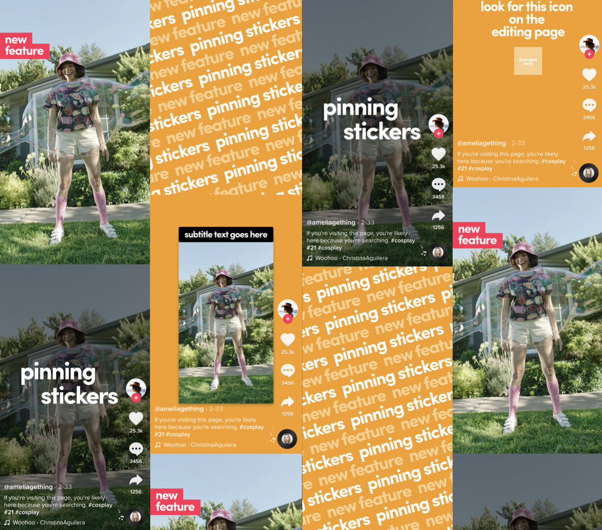
These new storyboards leverage bright colors from UGC and our discover banners, quick-cut text transitions, bold offset typography, and captions inspired by in-app text overlays. This outlined a quick and easy narrative for all demo videos to follow.
Future videos will implement this art direction and storyboard template. Here are some example videos below:


